 |
| InDesign Work
Letterhead - Creative Concepts logo
|
|
I came up with the concept of the logo with simplicity in mind. I also wanted to have the logo feel like a rainbow to give off the “graphic design” concept of being a range of colors. The starburst idea allowed me to keep the logo simple while at the same showcasing the rainbow idea. The white circle in the middle allowed the colors to feel like the overlapped each other. The title of the business is at the right side, in fancy font to give off an artistic tone that differs from the simplistic logo. The letterhead incorporates the logo as well as space for contact information. The nameplate has a distinct color that is easily recognizable from the other information on the page to catch the eye. The address and website information has an italics style to easily differentiate that information from the nameplate and title. The solid black line is used to bring a hard border between the letterhead and the body of the letters. |

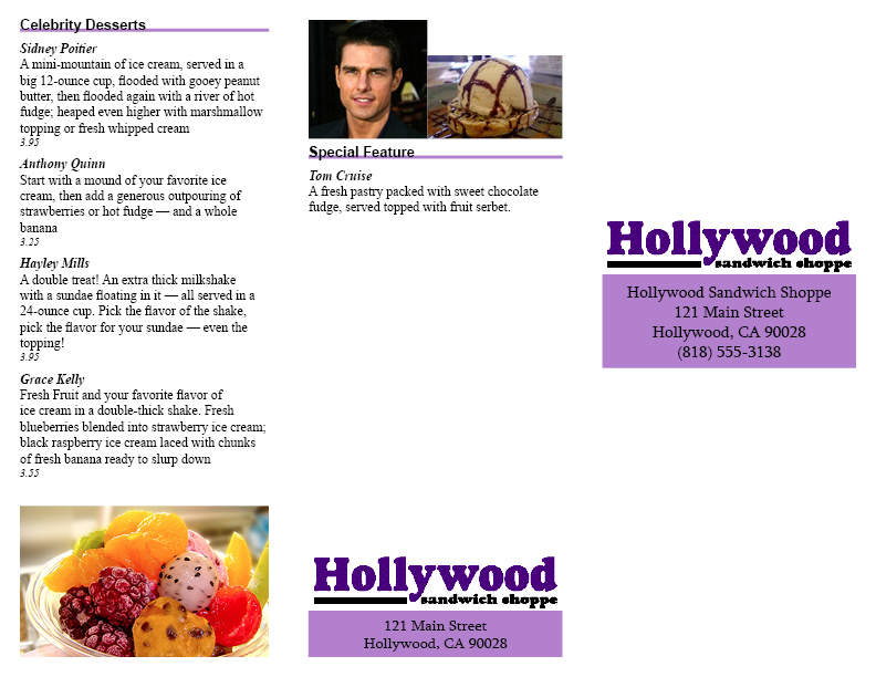
Menu - Hollywood Sandwich Shoppe
|
|
I created the menu using as little color as possible in the case the client wanted to print using black and white ink. The menu uses a trifold layout and there is content in each of the six sections of the front and back menu. There is a "Special Feature" section that can be changed monthly using the master page. There are placeholder boxes for the picture of the celebrity being featured as well as the menu item. When folded the restaurant's name and address can be seen on the front and back side of the page, so no matter what side the menu is on the logo can be seen. |
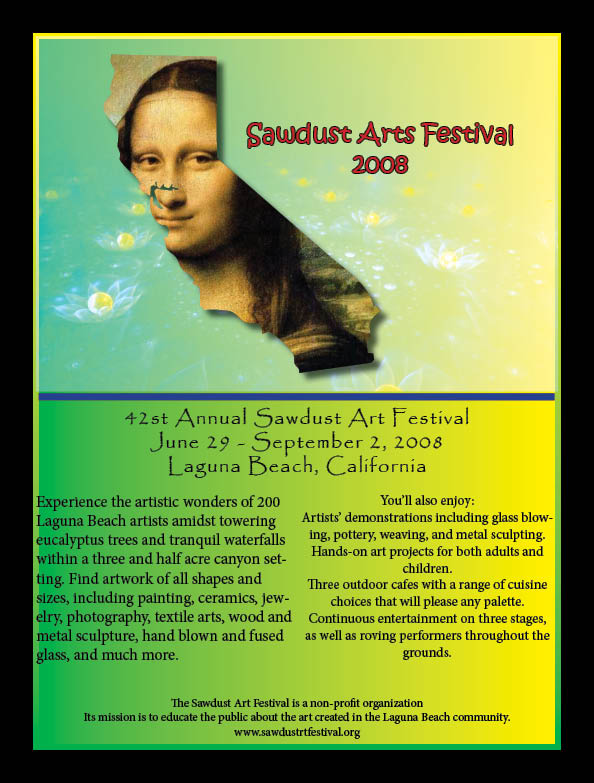
Poster - Sawdust Arts Festival 2008
|
|
The first thing I wanted is a green to yellow gradient. I really like the contrast from green to yellow and I think it does give off a California vibe. I also created a thick stroke around the green/yellow box with the same gradient. It really makes the centerpiece come out more. For the logo I want to have the artwork feel classical as well as contemporary, at the same time reminding everyone this is California. The Mona Lisa painting being inside the California state shape as having the trademark smile centered by the bay area really catches the eye. That Mona Lisa is placed on a background that is a digital painting of flowers on cosmic-style space. This digitalized artwork is to contrast the Mona Lisa painting. The event’s name is situated in to the right of the Mona Lisa for the readers to know of the event. |